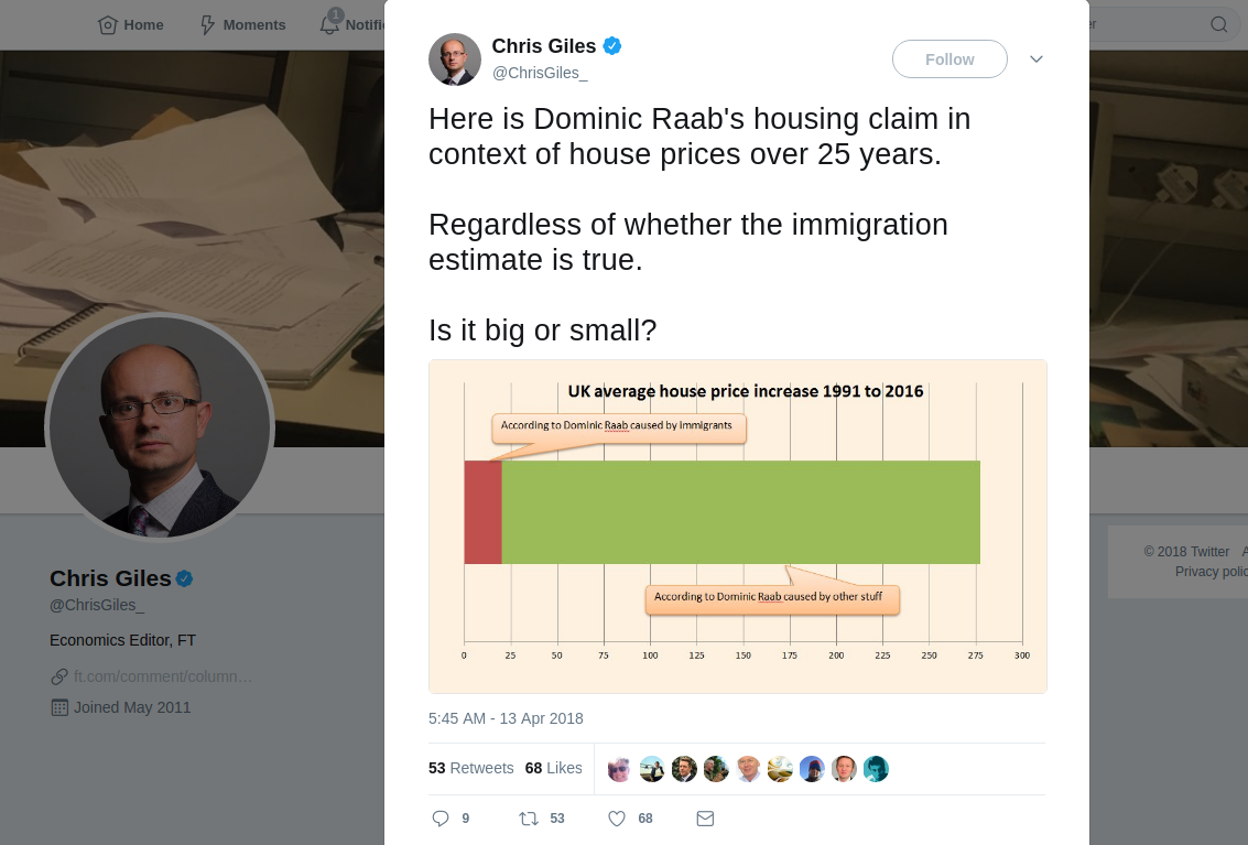

The above tweet [link] popped up in my twitter feed this morning, and it got me thinking.
Not about whether or not Dominic Raab’s claims* were valid.
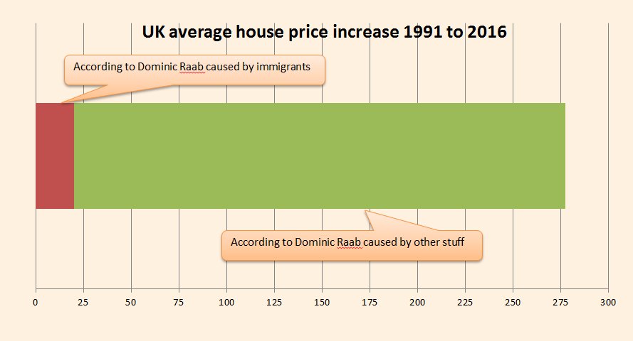
No, I spent quite some time trying to figure out what that “graph” (info-graphic is probably a better term) was trying to say.
I just couldn’t figure it out.
Now, I’ll be the first to admit, I’m no economist and I’ve never formally studied the subject. But I would describe myself as reasonably numerate and (as I have written before) as a mathematician I am far more interested in the applied side of the subject to the pure; I am used to taking equations, data, charts and graphs and interpreting them. But on seeing the above, I just couldn’t understand it.
First schoolboy error was no axis labels (and no numbers on the y axis at all.)
The headline in bold mentioned house price increase from 1991 to 2016, suggesting a time series graph, where we are accustomed to seeing time flow from left to right. The title did imply that we were looking at a change over time, yet this makes no sense in the context of the graphic (I’ve given up callling it a graph because, although presented to try and look like a graph for (I presume) gravitas, it ain’t a graph).
I was now becoming increasingly confused.
Having twigged it was not a time series graph, my mind then picked up on a couple of key features of the graphic. The title said “average house price” and the top number on the x-axis was 275. I knew that the average UK house price is around £275K (I’ve since checked – its a little lower, but in that ball park) so perhaps the graphic was meant to represent the average house price in the UK? But that made the chart even more nonsensical.
By this stage I was genuinely perplexed. I genuinely had no idea what this tweet and graphic was trying to say.
I could have (and perhaps should have) left it there and got on with my day. But I couldn’t. It was bugging me, so I did a bit of digging to see if I could fathom what the Economics Editor of the FT was trying to convey. It seems I wasn’t alone in my confusion, finding this thread on Reddit
[–]AlcoholicAxolotl1 point