My favourite curve

So what is your favourite curve (do you even have a favourite curve? You should!)

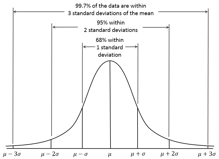
A contender would be the Normal Distribution curve, above, which encompasses so much of the natural and statistical world.

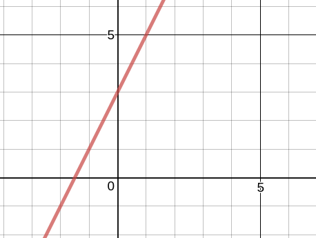
Or perhaps the more humble straight line: y = mx + c gets your vote

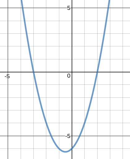
To simple? Well the quadratic curve crops up a lot and has the right level of difficulty to make it non-trivial, but is within the scope of all.

And then there is the sine curve, an understanding of which opens up a huge area of mathematics, not just a curve, but a wave.

Sine Curve

But none of the above are my favourites, although they all stake a good claim.

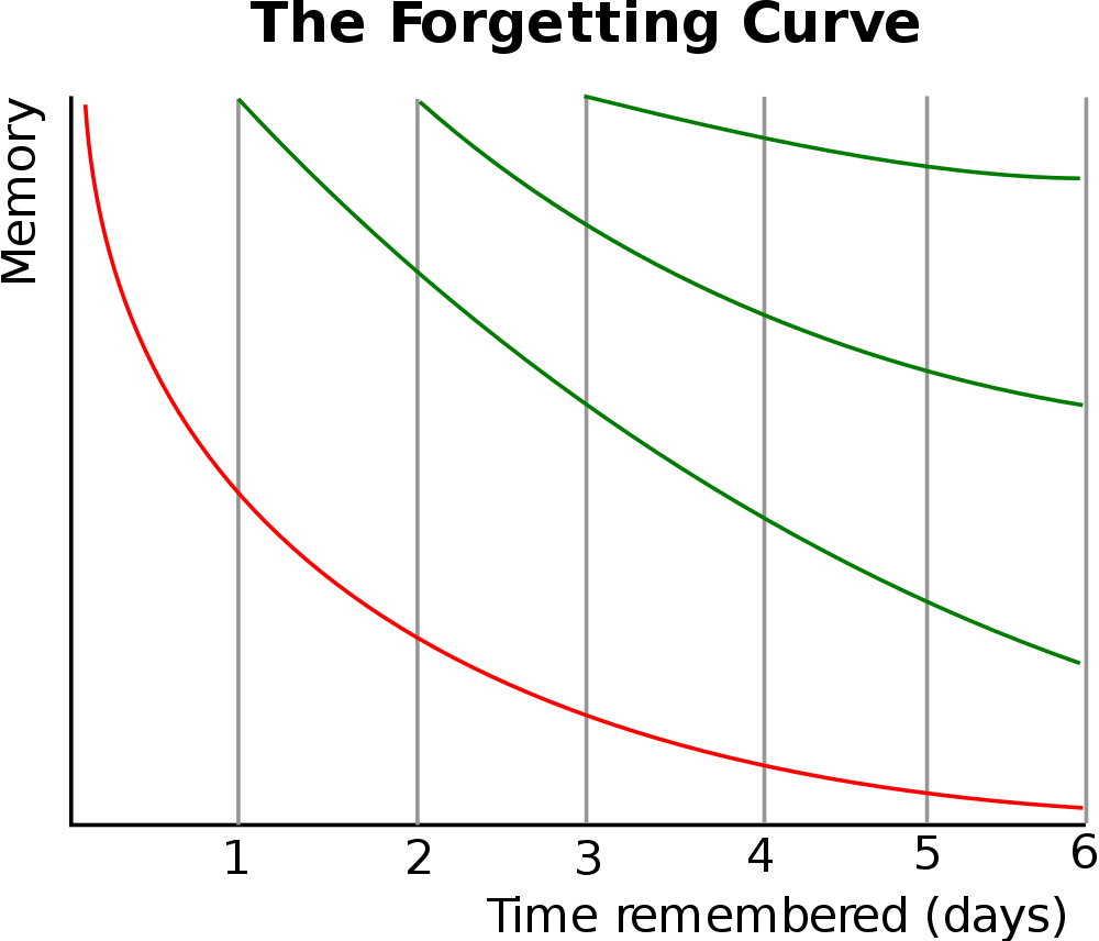
No, my favourite curve was first plotted by a somewhat obscure 19th Century German Physcologist, Hermann Ebbinghaus, his “Forgetting Curve”

Ebbinghaus Forgetting Curve

I first came across his curve a few years ago, and it made instant sense to me. In essence, we quickly forget what we have learned, no matter how well we may have been taught. However, if we revisit the work we soon remember but once again, we soon forget, although the “speed” of our forgetting is diminished, and we don’t forget quite as much as we did before.

If we continue this process, each time we forget less and retain more.

It confirms what experience has taught me – that we need to constantly revisit and revise work, it is not enough to master a topic in a week, because in a month we’ll have forgotten most of it.

The idea is being given a modern spin (retrieval practice and spaced learning being a few new buzz words that use Ebbinghaus’ work) and, whilst I think I’ve always done this in my teaching, since discovering Ebbinghaus I’ve made a more conscious effort to resist the relentless pressure to plough on with the syllabus and revisit work covered earlier in the term and year.

For example, every few weeks we have unit tests – so we revise a few weeks work for the test (the first revisit), but then after the test I also devote a lesson or two to revisit unit tests from earlier in the year, thereby revisiting topics again and again as the year unfolds.

To find out more about the Ebbinghaus Forgetting curve, this Wikipedia page is a good starting point.

And, as an aside, I’ve often thought that investigating the Ebbinghaus Curve could make for a good EPQ project – plenty to research, plus the opportunity to devise one’s own test to try and replicate the curve, thereby creating primary data of their own.

(Now having read this blog post, make sure you came back next week, next month, next year … to ensure you don’t forget it!!)
Posted in Teaching Tips | Leave a comment

Searching for the Solskjaer bounce

I’ve spent much of the last week helping students with “Hypothesis Testing” as they prepare for their A level exams in the next few months.

Fed up of wading through connived examples, and upon stumbling across perhaps the best headline I’ve read in sometime (“Man United regress to the mean after Solskjaer bounce“) I thought I’d use a bit of A level maths to see if the Solskjaer bounce was real or just another Norse myth.

(I’m about to walk through how this may be presented as an A level question, followed by my worked solution, so my less mathematically minded readers may want to skip the next few lines.)

Since taking over as manager of Manchester United in December 2018, Ole Gunnar Solskjaer (OGS) has transformed the club, returning it to winning ways.

In the season to date, in all competitions, Man Utd have won 24 out of 43 games.

Since OGS was appointed manager, Man Utd have won 15 of their 21 games.

Does the data support the theory that OGS has transformed the club at the 5% significance level?

Let p be the probability that Man Utd win a match. They have won 24 out of 43, so the probability of winning is 24/43 = 0.558

Ho:p=0.558
H1:p>0.558

The null hypothesis is that the probability is 0.558, the alternative hypothesis is that the probability of a win (under OGS) is greater

Let X be the number of wins in a sample of 21 games (the games that OGS was manager)

If Ho is correct then X~B(21,0.558)

We’re modelling the data as a Binomial distribution as there are two outcomes: win, don’t win.

Test statistic: X = 15 (the number of games OGS won)

P(X>=15) = 1 – P(X<=14)

= 1 – 0.8905 = 0.1095

We use our calculator in Binomial CD mode to find the cumulative probability of up to, and including 14, then take that away from 1 to get the probability that Man Utd would win 15 or more of their games under the null hypothesis (i.e OGS has made no difference), which works out to be 0.1095 or 10.95%)

0.1095 is not less than 0.05

Sometimes easier to think in percentages, even if we give answers as decimals. 10.95% is not less than 5% (our significance level)

So there is insufficient evidence to reject Ho, our null hypothesis

(Non-mathematicians, start reading from here)

At the 5% significance level, there is no evidence to support the theory that OGS has transformed the club.

Or, in other words, the Solskjaer bounce is probably just a myth.

We have shown that even if there had been no change of manager there was a 10.95% chance Man Utd would have won 15 out of the next 21 games.

In fact, even if we widened the significance level to 10%, the data still wouldn’t have supported a Solskjaer bounce. Winning 15 out of the 21 games since taking charge whilst unlikely was not so unlikely that it couldn’t have been due to chance rather than the genius that is OGS.

My theory: if we’d looked for the bounce a little earlier, we may have found evidence for it – perhaps the bounce peaked at around 15 games and Man Utd are, indeed, now regressing to the mean.

As ever, statistics raises as many questions as they answer, but it is good to be able to apply some A level mathematics to answer a “real” question.

Posted in Handling Data, Probability | Tagged , | Leave a comment

What chance Brexit?


What chance Brexit?

As the deadline date of March 29th looms ever closer, are we any closer to finding out what will happen?

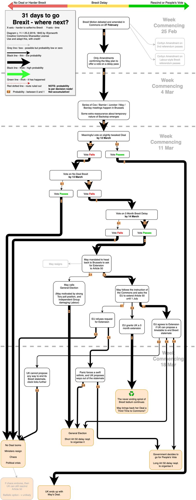
On his blog Jon Worth has produced an excellent flow chart where can follow all the possible twists and turns before ending at one of five possible outcomes. In addition to suggesting possible outcomes, he has added probabilities at each decision point.

Using nothing more than GCSE Maths*, it is then possible to calculate the probabilities of the various outcomes.

I’ve done the maths for you, the results are below (rounded to 2 decimal places)

  • No Deal Brexit 0.25 (or 25% chance)
  • General Election 0.22 (or 22% chance)
  • Never ending spiral/May brings deal back to Commons for 3rd time 0.17 (or 17% chance)
  • Peoples Vote 0.15 (or 15%)
  • May’s Deal 0.2 (or 20%)

So, not much to pick between any of those.

Once again, many thanks for Jon Worth producing his flowcharts and sharing them (under creative commons sharealike license): Do visit his site : Brexit – Where now? The flowcharts and follow him on Twitter 

*Although looking a little more complicated, this is no different from the decision tree questions when Bob & Linda play badminiton, familiar to many a Year 11 student. To find the probability of following a route to its conclusion, multiply all the probabilities along the path. Then add all the probabilities of the routes to that end to find the total probability of reaching that outcome. If unsure, ask a GCSE student – they’ll be able to explain!

Posted in Probability | Leave a comment

An ‘L’ of a chance

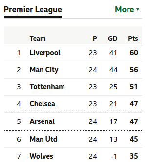
If you look at the Premier League table this evening you will see that Liverpool sit proudly atop the football pyramid.

No great surprise there, you may think.

But then see who tops the Championship tonight: Leeds United.

League One? Luton Town, and League Two? Yes, you’ve guessed it, Lincoln City.

So all four of the top leagues are crowned by a team beginning with the letter L. All the more surprising as the only other team in the 92 that begin with L are Leicester City (who, coincidentally, play Liverpool this evening.)

But gets even better – if we go down to the next tier, The National League, we find that Leyton Orient lead that divsion!

What are the chances of that – having a team beginning with L at the of the top all first five leagues in English football?

Less than one in three million, I reckon.

(One in 3,317,760 to be precise)

So how did I arrive at this answer? Here’s how:

I assumed each side had the same chance of topping their table.  With two out of twenty teams in the Premier League beginning with L, the probability of one of those teams topping the table is 2/20, which simpilfies to 1/10. By no means a certainty, but not improbable, either.

The Championship, League One, League Two and National League all have twenty four teams, with only one beginning with an L. So the probability is 1/24 that an L will top, say, the Championship.

But for all five leagues to be topped by a team beginning with L, we need The Prem, and The Championship, and League One, League Two and National League to all have L’s at the top, so we need to multiply those probabilities together:

1/10 x 1/24 x 1/24 x 1/24 x 1/24 = 1/3,317,760


Not sure if its ever happened before, but take a moment to enjoy it whilst it lasts – not an everyday occurrence.

I know who I’ll be supporting between now and the end of the season!

Posted in Probability | Tagged , , | Leave a comment

Six Nations Stats

Back in the summer, we were all struck with World Cup fever and, in this post, I shared some stats and charts looking at the heights of players in the tournament.

In a few days time the Six Nations rugby tournament kicks off for another year, so I thought it appropriate to have a look at the stats of those involved.

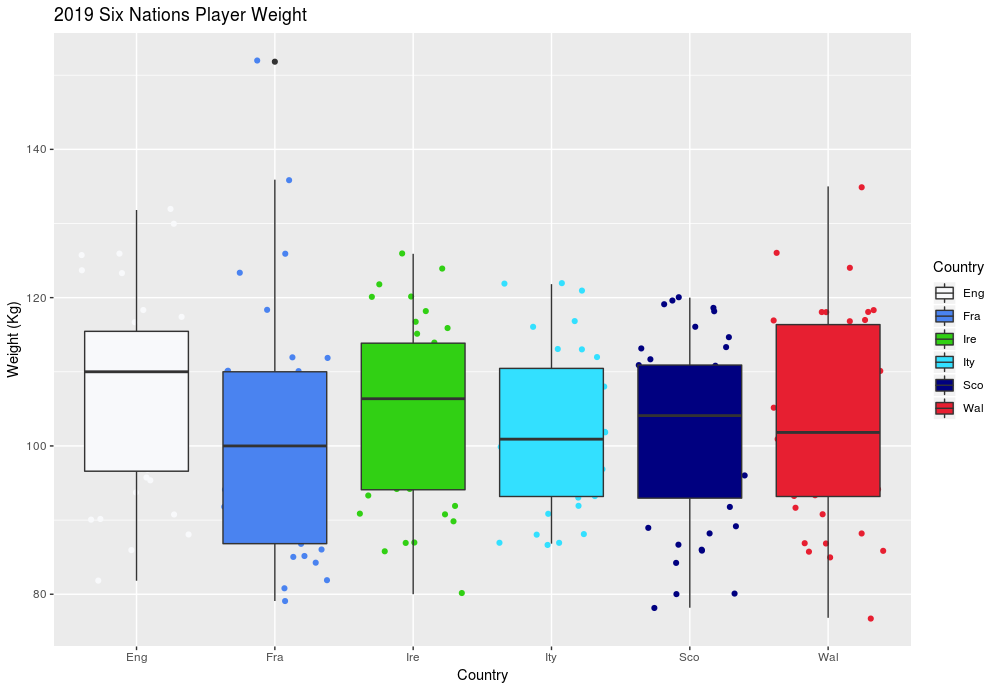
Above you can see a box plot illustrating the weights of the six squads.

[In a box plot, the line through the box is the median – or middle – value: half the players are heavier than this value, half lighter; the top of the box the upper quartile – 75% of data values (in this case, player weights) are below this line; the bottom the lower quartile – 25% of data values are above this line; the upper and whiskers  lower whiskers denote data values that fall outside the middle 50%.]

The plot above suggests to me that England have the heaviest squad, France the lightest, and also the team with the greatest range of weights.

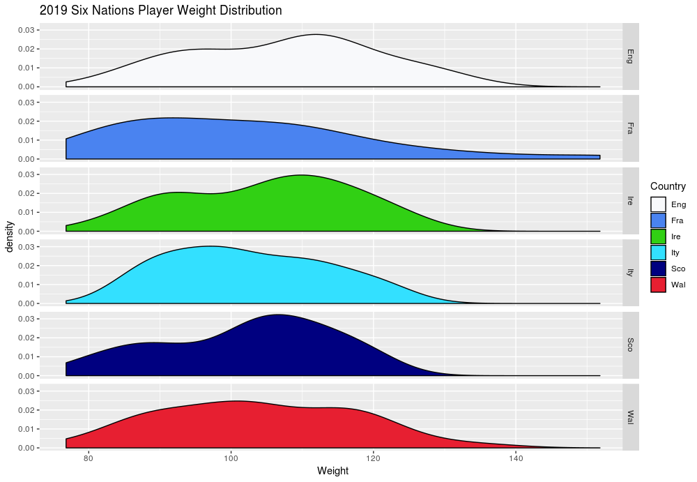
Another way to look at the weight of the squads is using density plot, below:

Having plotted the above, it looked like there were a couple of peaks in some of the distributions, particularly noticeable in the England, Ireland and Scotland squads.  If we took a random selection of the population we world expect to see a much more smooth “normal” distribution, or bell curve.

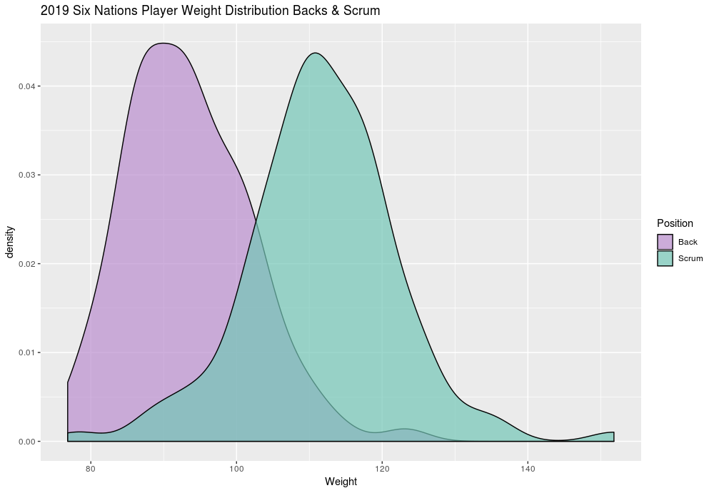
But a rugby squad is not normal! I suspected that the weights of those who play in the scrum would be more than those in the backs. So I let the data do the talking, comparing all players taking part in the tournament by position: scrum or backs (I combined the data from all nations as to do this on a country by country basis would result in sample sizes that were too small)

The individual distributions for the backs and scrum are fairly “normal”, but it is clear that backs tend to be lighter than those who ply their trade up front in the scrum.

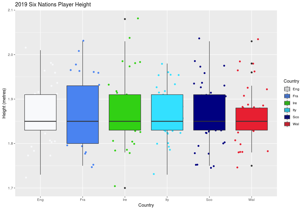
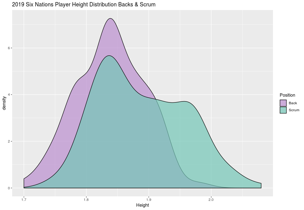
So what about player height? Below you can see some charts that map this data.

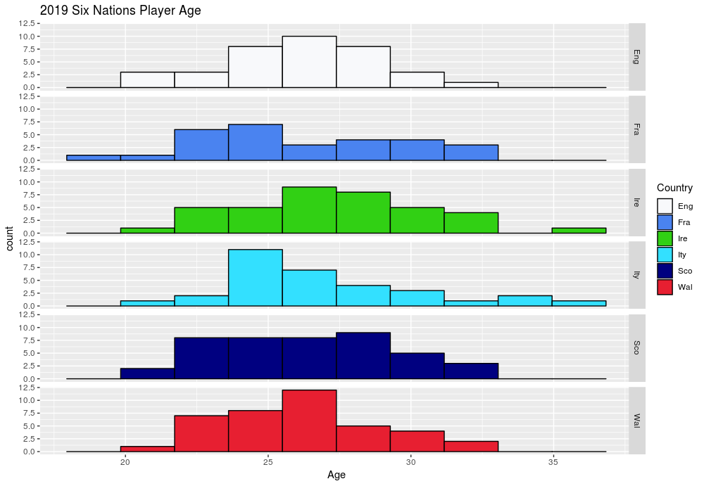
I also had a look at the age of each squad:

I’m not sure if any of the above can help predict the eventual tournament winners, but you might find it interesting reading as we eagerly await Friday night’s kick off.

(Data source)

Posted in Handling Data | Tagged , | Leave a comment